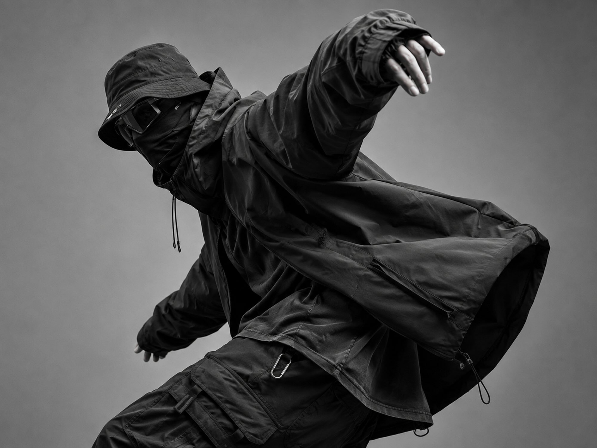
SKATTR®
[
Skateboarding & Snowboarding
]
CONCRETE TO POWDER
A CAMPAIGN AND DIGITAL LAUNCH SHOT WHERE SKATE CULTURE ACTUALLY LIVES.
[
Project data
]
SKATTR®
Skateboarding & Snowboarding
Title
CONCRETE TO POWDER
Client
SKATTR®
Released
Timeframe
6 weeks
Project type
Campaigns
Technology
Framer Shopify After Effects Lottie

[
01 — Overview
]
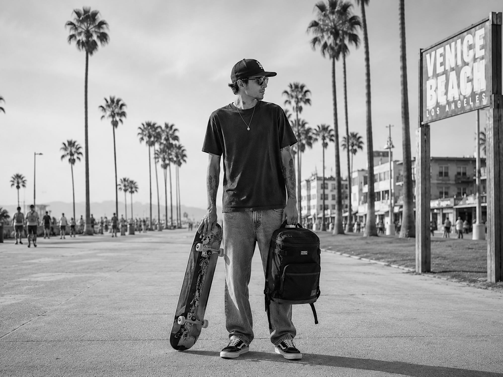
SKATTR® makes boards for people who ride pavement in summer and powder in winter, in a category that mostly photographs like a studio floor. We took the launch to the Venice boardwalk and shot it the way a skate photographer would work it. The digital launch page was built to stay out of the way — photography large and unhurried, the product grid held back until the story has been told.

[
02 — The challenge
]
THE BOARD WITHOUT THE STOCK SHOT
Skate and snow brands mostly look the same: studio floor, clean product, a rider who's never actually dropped in.
SKATTR® builds boards for people who ride them hard in both seasons — pavement in summer, powder in winter. The category's visual language rarely shows that split identity. Product photography stays polished and generic, and the sites built around it feel just as disconnected from the culture. The brand wanted a launch that looked like real skate culture from day one, on a coastline that's produced decades of it, without the campaign getting swallowed by the location.
[
03 — The solution
]
THE STREET AS THE STUDIO
Venice Beach as the set, shot the way a skate photographer would work it.
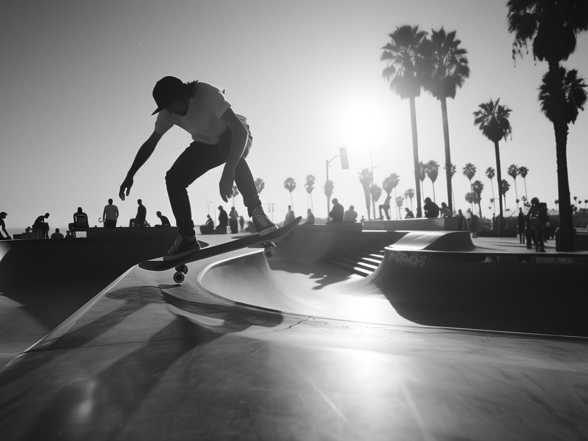
We cast the campaign around a single rider and one location — the Venice boardwalk, palm-lined, unmistakably itself — and shot it in available light across one afternoon rather than staging a studio day. The board stays a prop in the frame, not the subject of it, which is what made it believable. The digital launch page runs the same photography large and unhurried, with the product grid held until the second scroll. Social cutdowns kept the same pacing so the campaign reads as one continuous piece rather than a hero shot and a product catalogue bolted together.

A single-location campaign shot like documentary photography, not product photography.

A launch page that lets the story run before the catalogue starts.
[
04 — Performance results
]
ONE AFTERNOON, STILL RUNNING
A single-location shoot became the brand's entire launch season. The campaign ran across the landing page, paid social and retail without a second production day.
Organic reach
3.1M
Across the launch month, with no paid amplification in week one
Sell-through
68%
Of the first board run inside six weeks
Production
1 day
One rider, one location, available light
The motion loops cut from the same footage are still the brand's highest-performing social format a year on.
[
05 — Final thoughts
]
The best campaign asset was already there. Our job was to not get in its way.
[
Credits
]
Zélie Mateo Jade Cole
Campaign Direction Strategy Content Project Lead