CASA DI LUCE
[
Fashion
]
SOUS LA LUMIÈRE
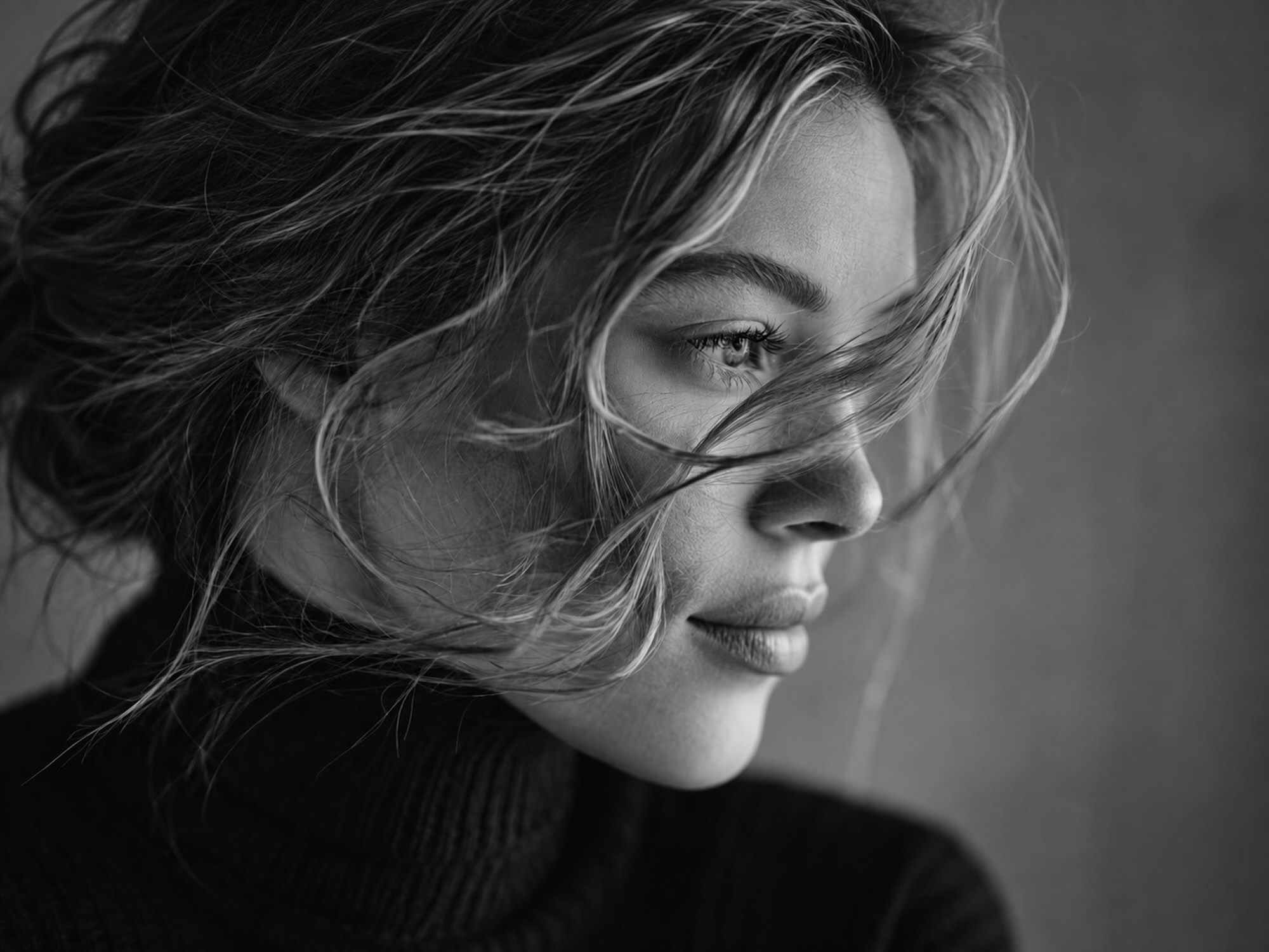
A CAMPAIGN SHAPED AROUND SOFTNESS, MOVEMENT, AND CONTROLLED LIGHT.
[
Project data
]
CASA DI LUCE
Fashion
Title
SOUS LA LUMIÈRE
Client
CASA DI LUCE
Released
Timeframe
8 weeks
Project type
Campaigns
Technology
Framer Lottie Figma Capture One

[
01 — Overview
]
Casa di Luce's campaigns photographed beautifully and carried nothing from one season to the next. We built a quieter visual language around natural light, proximity and movement — designed to hold together across editorial, social and seasonal releases. The result runs slower than the category is used to, on purpose. Window light, minimal retouching, and typography that sits around the imagery instead of competing with it.


[
02 — The challenge
]
THE CAMPAIGN WITHOUT THE GLOSS
The brand needed a softer visual language that could feel premium without turning distant.
Casa di Luce's previous campaigns relied on stylised fashion imagery — polished, controlled, technically flawless, and largely interchangeable with the rest of the category. It photographed well in isolation but carried no emotional continuity from one release to the next. The brand wanted a direction built on light, proximity, and quiet movement instead of styling — something that could scale across seasonal drops without losing the intimacy that made the early reference images work.
[
03 — The solution
]
THE SOFTNESS WITH STRUCTURE
A visual system built to hold emotional consistency across stills, motion, and editorial layout.
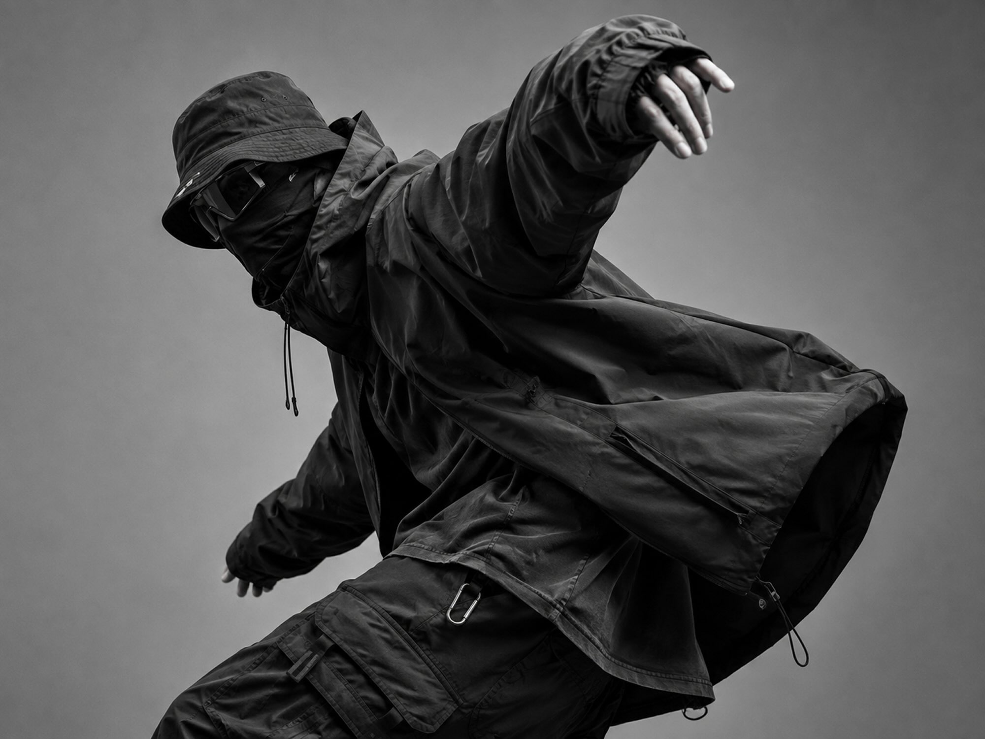
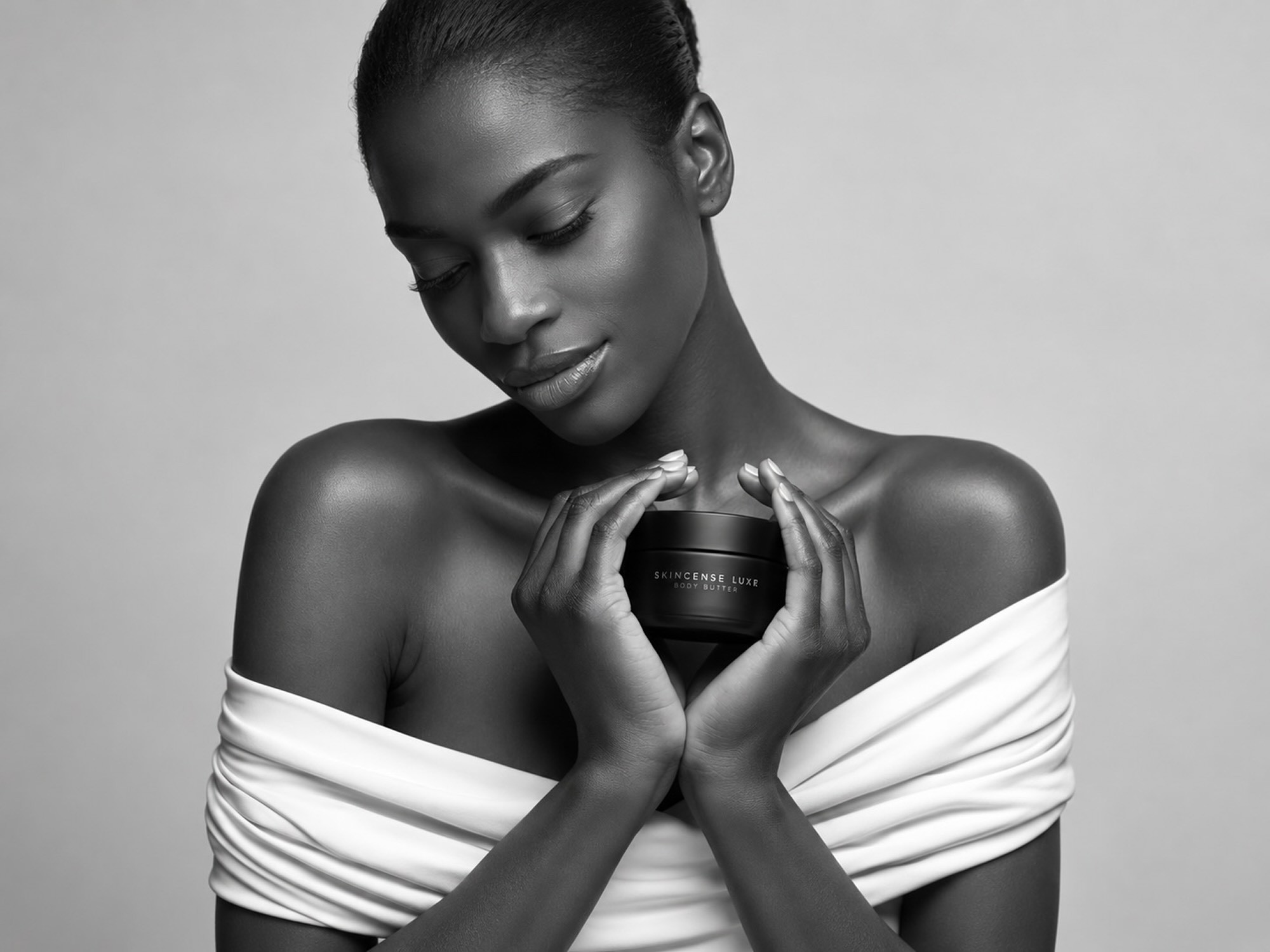
We shot the campaign in available window light with minimal retouching, letting movement — hair, fabric, breath — carry the frame instead of pose. Typography and pacing were designed to sit quietly around the imagery rather than compete with it, so the same visual rhythm could travel from a single portrait to a full editorial spread. The digital experience runs the campaign at a deliberately slow scroll pace, with motion sequences timed to match the photography's own stillness. The result reads as one continuous piece of light rather than a set of campaign assets stitched together after the fact.
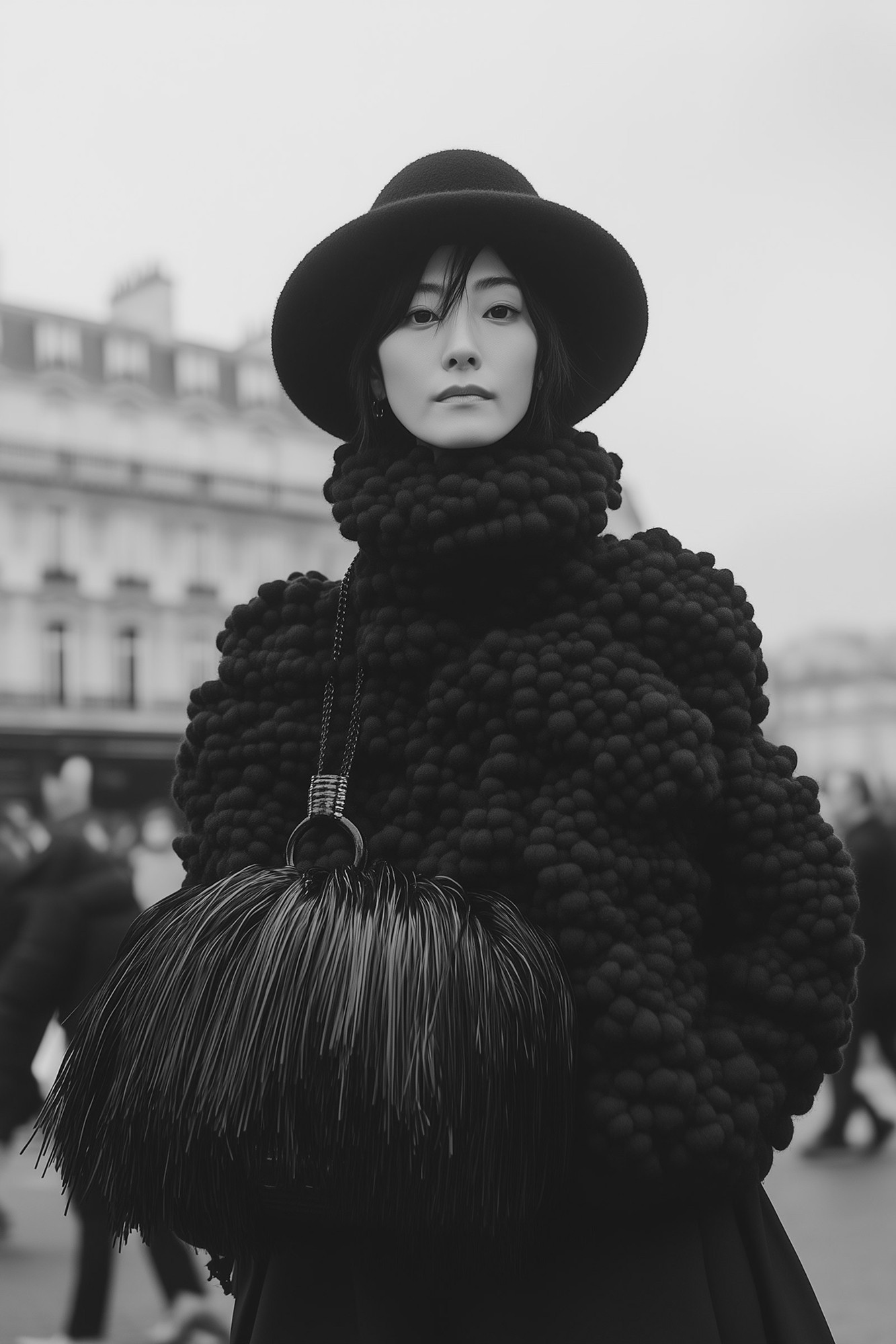
A campaign system where light and proximity carry the story instead of styling.

A digital experience paced to match the photography's own quiet rhythm.
[
04 — Performance results
]
SOFTER AND STILL SELLING
The campaign launched with the spring collection and became the brand's first visual system to survive a season change intact.
Lookbook engagement
+71%
Time spent, against the previous season's campaign
Seasons on one system
3
Without a redesign of the campaign language
Production cost
−52%
Per campaign, with retouching largely removed
The same rhythm now travels from a single portrait to a full editorial spread — the continuity the brand had been missing.
[
05 — Final thoughts
]
Premium didn't need to mean distant. Light and proximity did the work that styling used to.
[
Credits
]
Zélie Jade Cole Nigel
Art Direction Content Project Lead Development