Typography Is a Load-Bearing Decision
A typeface choice sets the ceiling on everything built after it.
6 min
read
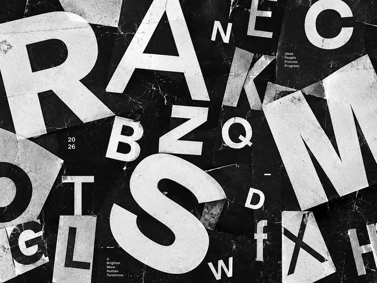

Typeface selection is often treated as taste. In practice it is infrastructure. The face determines how dense a page can get before it becomes unreadable. It determines whether long-form content is viable. It determines how much hierarchy is available before sizes start colliding. Change the face two years in and the layouts do not survive the swap. Line lengths shift. Vertical rhythm breaks. Components that fit stop fitting. This is why the decision deserves more scrutiny than it usually gets, and why it should be made against real content rather than a specimen.
TEST AGAINST THE WORST CASE
Typefaces are chosen using ideal text. Short headlines. Curated words. Copy written to fit.
Real products contain none of that. They contain German compound nouns, all-caps legal disclaimers, seven-digit numbers, user-generated names with no spaces, and headlines written by someone in a hurry.
Set the candidate face in the ugliest content the project will ever hold. A dense table. An error message. A form label that runs two lines on mobile. If it holds there, it will hold anywhere.
Weight availability matters more than the number of styles. A family with three genuinely distinct weights beats one with nine that all read alike at body size.
SCALE IS WHERE SYSTEMS BREAK
Most type scales are built from a ratio and then quietly abandoned. A designer needs something between two steps, adds it, and the scale stops being a scale.
The fix is fewer steps, not more. A system with five sizes forces real hierarchy decisions. A system with twelve lets every screen invent its own.
Line height is where the discipline usually fails first. Display sizes need tighter leading than body text, and applying one global value produces headlines that float and paragraphs that crowd.
Optical sizing deserves attention too. A face set at 72px needs different tracking than the same face at 14px, and variable fonts make that adjustment nearly free.
None of this is visible in a presentation. All of it is visible eighteen months later, in the pages nobody art-directed.